Categories
Release Notes

Fluidics 2.1: The Widget Update

Fluidics 2.1 is now available on the App Store, and comes some new, iOS 14-style widgets.
Do It All

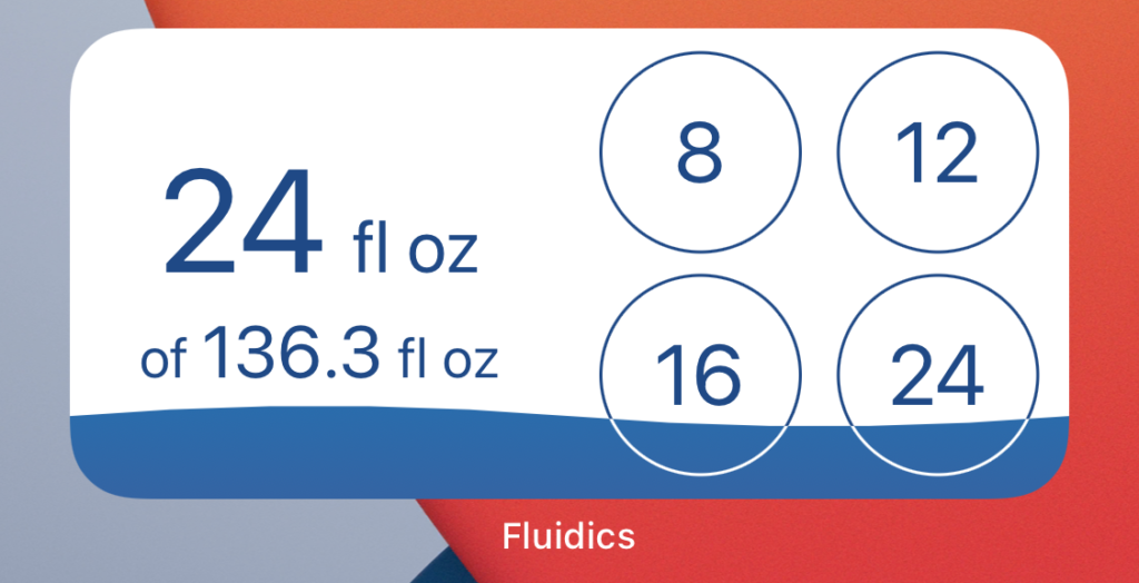
See your status, and quickly log from your quick actions.
At A Glance

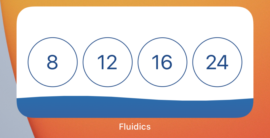
Quickly log, without the pressure of a numerical goal.
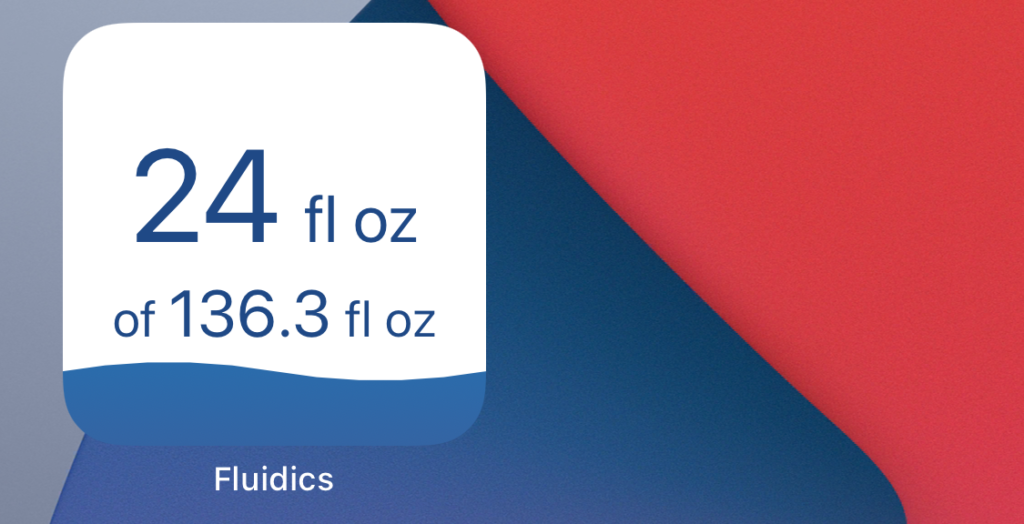
Screenshot of the iOS 14 'status' widget, small form, showing progress toward the goal.

Quick Information

See your progress, and act with just a tap.
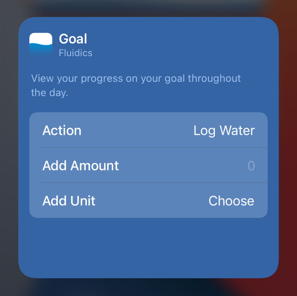
Screenshot of the widget editor, showing a choice of actions, and a customizable amount to add when tapped.

Under Control

Tap somewhere on the widget other than the quick adds? You can control what happens next – log a custom amount, or open to a specific section of the app, it’s up to you.

Composite image of the light and dark theme icon.

Choose Your Icon

For Pro users, you can now choose between the default icon, or the Dark Theme icon.

Custom Add, Custom Unit

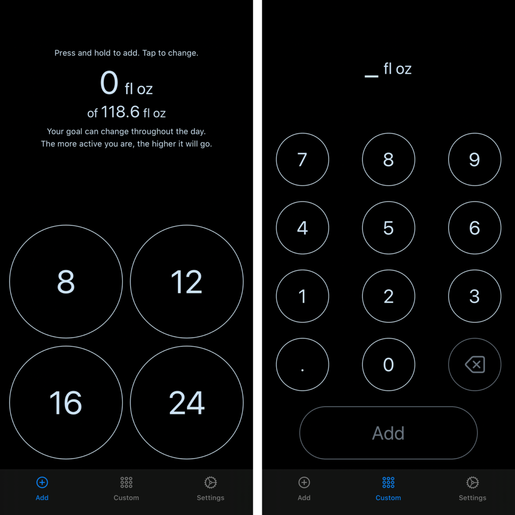
Want to add water in a different unit than you usually use? You can now long-press on the ‘add’ button on the Custom Add page to add using your choice of unit.

Download now!

Fluidics remains free to download, and just $0.99/year to unlock the Pro features. Get it now on the App Store:


To learn more about the development of Fluidics, you can read the release post here.

And, for the historical record, the release notes, as they appeared on the App Store:

Hello dear user, and welcome to iOS 14! Fluidics has some shiny new widgets for you to enjoy:

  • See your current status in the small widget size.
  • Quickly log water with the medium widget size – and your choice of showing your progress toward your goal in text, or just in how full the widget is.
  • Adding something in Custom Add, but want to use different units? Long-press on the ‘add’ button, no more back-and-forth to the Settings tab.
  • For our Pro subscribers, you can now choose which app icon to use – try out the Dark Theme, if you’d like.
Categories
Release Notes

Fluidics 2.0

Fluidics 2.0 is now available on the App Store, and comes with a new coat of paint.

Screenshots showing Fluidics in Dark Mode

Dark Mode 🕶

With support for iOS’ Dark Mode, Fluidics automatically shifts to match your preferred appearance. If you’ve set your iPhone to automatically switch, Fluidics will follow suit; no more being blinded when you check your goal at night!

Screenshots showing the new Settings and Quick Add screens, which match the iOS design language.

That iOS-y Feeling

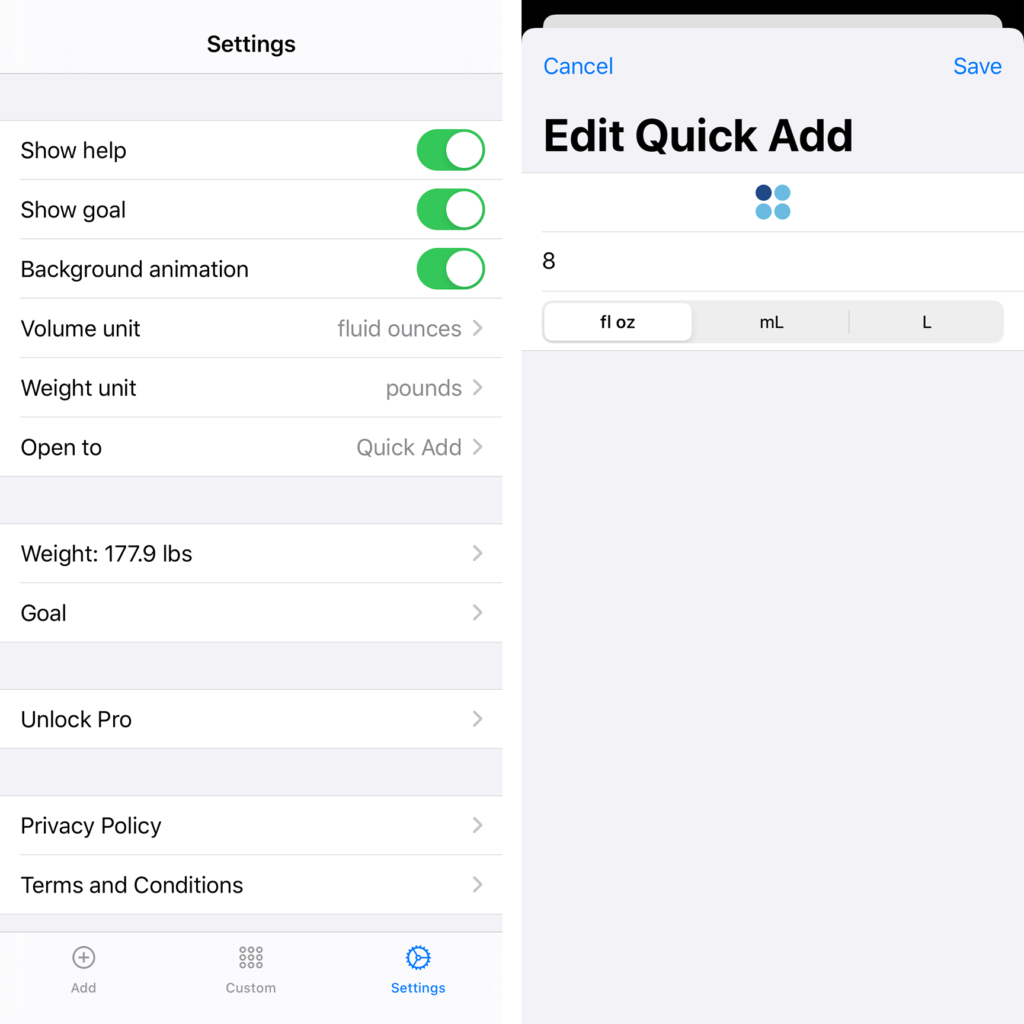
The Settings and Edit Quick Add screens have been rebuilt to feel much more at home on iOS, and take advantage of all the system-level shortcuts. Swipe from the left to go back a screen in Settings, and pull down to dismiss the Edit Quick Add screen if you change your mind about changing it up.

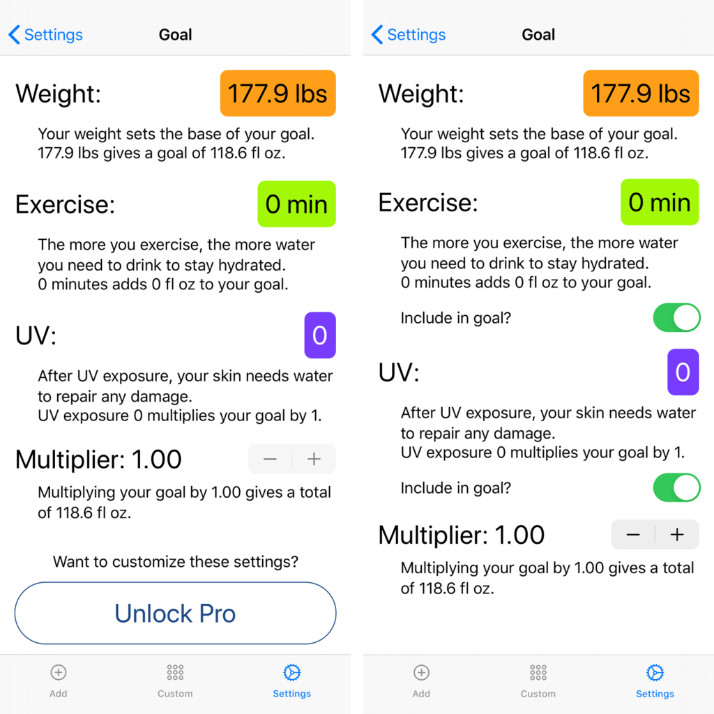
Screenshots of the new Goals screen, showing both the free and Pro versions.

Your Goal, Your Way

Get a better understanding of how we’re calculating your goal with the redesigned Goal screen (accessible via the new Settings tab).

And, with a Pro subscription (still just $0.99/year!) you can customize even more of your goal – set your own multiplier, and pick and choose which pieces of your health information go into the algorithm.

Tabbed Logging

Screenshot of the tab bar in Fluidics, showing Add, Custom, and Settings.

Switching screens in Fluidics is easier than ever, with the new tab bar. Always there to show you where you are, and now you can hop from Quick Add to Settings and back, without wearing out your swiping finger.

Download now!

Fluidics remains free to download, and just $0.99/year to unlock the Pro features. Get it now on the App Store:


To learn more about the development of Fluidics 2.0, check out the release post over here.

And, for those interested, the release notes as they appeared on the App Store:

Fluidics 2.0 is here, dear user; please enjoy this lovely new coat of paint, and all the performance improvements and bug fixes that we’ve been working away on. Here’s the exciting bits, though:

  • Dark Mode support! No more getting blinded when you go to check your goal at night.
  • Tabs make it easier to get around; save your swiping finger, and tap away.
  • Editing your Quick Adds feels much more at home on iOS, thanks to the new ‘card’ design.
  • Settings has much more room to breathe, and we used that room to make the Goal settings easier to read and, for our dear Pro users, that much more customizable.

We’ve been working on this one for a while, and hope you enjoy it!

Categories
Release Notes

Fluidics 1.3: The Subscription Update

The Subscription Update! Worried about apps with no visible business model? Worry no longer; for just $0.99 per year, you can support ongoing development of your favorite water-tracking app. In case that alone doesn’t convince you, that subscription also gets you the ability to customize the way we calculate your goal, and a neat new version of the widget that shows your progress towards that goal.

Other new features:

  • A new ‘Goal’ page to see how your goal is being calculated from start to finish.
  • Measurements are localized better, so you won’t see improper grammar like “24 fluid ounce” anymore.
  • Some nice optimizations so the app is ready even faster.
  • Various bits of under-the-hood work to support future features. (No spoilers!)

For more about the creation of this update, see this post.

Categories
Release Notes

1.2.1

Fixed a bug that could cause the app to crash while it was trying to use the handy new caching stuff. Whoops!

Categories
Release Notes

Fluidics 1.2: The Settings Update

The Settings Update! You can now choose which unit to use for each Quick Add, instead of being stuck with one overall, and there’s a whole lot more visual settings to tinker with, for the customizers out there.

The Big List:

  • Redesigned the stuff that shows the first time the app runs, it looks nicer now.
  • You can now choose which unit to enter your weight in, if it isn’t coming automatically from the Health app.
  • There’s a bit more caching going on, so as you open the app throughout the day it’ll have accurate information quicker.
  • That lovely background animation is now optional; if you’ve got Reduce Motion on, it’ll be off by default, but if you really miss it, you can turn it back on from the new Display Settings card.
  • Showing the goal is optional as well, so if you were feeling overly pressured, you can switch that off.
  • Reorganized the settings page to take advantage of the fancy new cards, courtesy of Alexis Aubry; there’s more information in the new ‘About’ card, if you’re curious.

For more about the creation of this update, see this post.

Categories
Release Notes

Fluidics 1.1: The Animation Update

The Animation Update! Swiping from screen to screen is now smoother and the water is no longer frozen but flows smoothly.

Other changes:

  • The goal algorithm was a bit over-zealous when you’d been working out, we told it to calm down a bit.
  • Added a bit of text to the Settings screen to remind you that this is an app, not a doctor, so please take your health questions to a doctor.
  • Fixed a bug that could make the water look a bit wonky if you opened the app while on a phone call and then got hung up on.
  • The goal algorithm could get stuck using old information in the mornings; gave it a new alarm clock and coffee maker, it’ll be up to date now.
  • The Custom Add page wouldn’t let you use milliliters, it was very determined that everything was in fluid ounces, but it’s now learned how handy the metric system can be.
  • Quick Add values of more than 999 (of whatever unit) had Problems; they work properly now.
  • Significantly improved support for VoiceOver.
  • Under-the-hood changes to make future features possible. No spoilers!

For more information about this update, read the update post.

Categories
Release Notes

1.0.1

Fixed a bug that could make your Quick Add options shuffle around – thanks to the folks who pointed this out!

If you had exactly met your goal, the screen would still have a bit of un-filled space at the top. That felt very unsatisfying, so now having 100% of your goal will also mean having a 100%-full screen.

The first time you connected Fluidics to Health, it could take a while for it to actually do anything with the new data; now it’s much quicker about that.

Categories
Release Notes

Fluidics 1.0

Fluidics is now available on the App Store!

For more information about the process of creating Fluidics, see this post.